← Return to topic

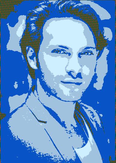
"Matt D'Angelo feeling blue" art by Pake1

Catashh · 29 Jul 2026 at 17:31 · permalink

Dropped a finished (enough) digital piece. Not game screenshots — actual art thread.

Looking for critique on composition and values more than "looks cool".

(Shared in the spirit of r/SpecArt — original credit to the artist; remapped onto clan tags for the demo board.)
Artist handle on source: Competitive_Face418
j0rney13131313 · 29 Jul 2026 at 17:36 · permalink

If you open commissions later, ping the recruiting channel — people will bite.

jailsonsantos49 · 29 Jul 2026 at 17:45 · permalink

Values read well from thumbnail size. That matters for sigs.

jaworjwr · 29 Jul 2026 at 17:53 · permalink

I would push contrast a little on the focal point. Otherwise clean.

jir0593 · 29 Jul 2026 at 18:01 · permalink

If this becomes a banner, leave more empty space on the right for text.

jokreqq · 29 Jul 2026 at 18:10 · permalink

Love the line weight. Traditional pieces hit different on this board.